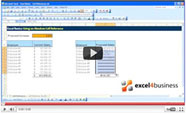
Excel Help - How to Create a Clustered Column Chart in Excel 2013
This video will show you how to make clustered column charts in Excel. This is very useful if you want to compare values, such as data from different years.
Start by selecting all the data you want to include in your chart, making sure to include column titles and row headings. If all your columns are next to each other, you can select them all in one go. If not, press the CTRL key on your keyboard – or CMD if you’re using a Mac – and hold it down.
Go to the Insert tab. In the Charts group in the Ribbon, select Column.
Alternatively, you can choose “Recommended Rharts” and choose from a selection of frequently used charts. Click on Clustered Column.
If you would like to make changes to the column chart, use the Design tab.
More options for customizing your chart are available when you select from three shortcut buttons to the right of the chart. The first button allows you to add elements. The second one lets you modify the style of the chart. The last button helps you filter the data in the chart.


