Excel Help - How to Create a Pie Chart in Excel 2013
This video will show you how to create pie charts in Excel. This is very useful when you want to visualize your data and show the proportion of the whole that each value constitutes.
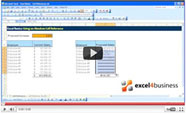
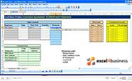
Start by selecting the data you want to see in your chart. Make sure you include column titles and row headings if you want them to appear in the chart.
Now go to the Ribbon and select Insert.
Choose the Recommended Charts button to see the program’s suggestions for visualizing your data.
Alternatively, go to Chart to see all available types of charts. Select the icon for Pie Charts.
A pie chart with your data will now appear on the spreadsheet.
You can use the Design tab to change the appearance of the chart. You can also use the legend that appears on the right-hand side to edit and customize your chart. The first button lets you add new chart elements, the second button is for modifying the style of the chart, and the third button lets you filter data in the chart. You can also manually drag and drop the corners of the chart to change its appearance.


